
Oat Milk
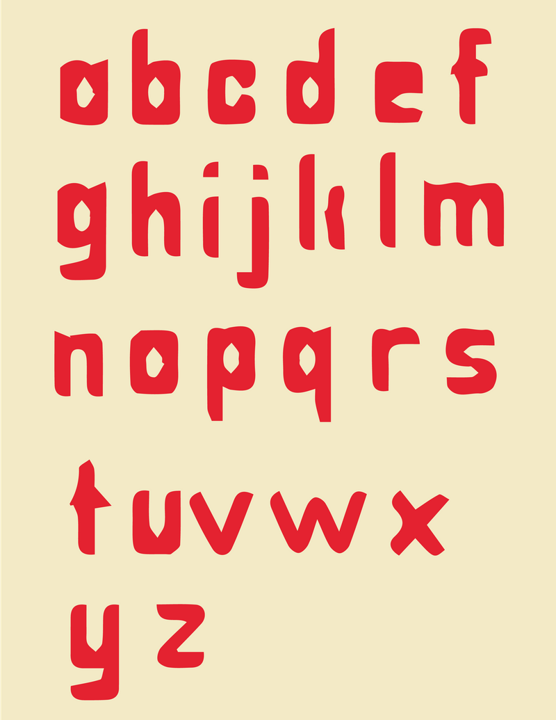
Modular Type
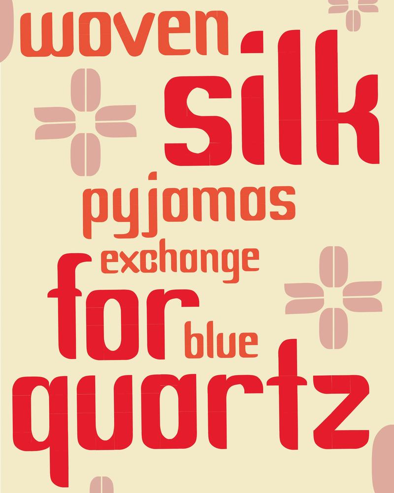
For this project, I developed a typeface rooted in a modular system composed of five distinct shapes. Each letter in this typeface has been crafted using only these five foundational modules. Employing a grid as my guiding framework, I refined the design through three distinct revisions. The culmination of this effort is a cohesive set of 26 characters that possess both legibility and a harmonious visual relationship. You can view an accompanying specimen sheet and mock-up below.

Process
My creative process is grounded in research and iterative refinement. For this font I drew inspiration from a plant-based food line, aiming to embellish my letterforms with a sense of sleekness and smoothness. In the initial iteration, my letters appeared excessively bulky and lacked readiness for public presentation. Subsequent iterations were dedicated to refining the letterforms, focusing on reducing the width of the central strokes while preserving a whimsical and bold typeface character. You can explore my process work in the accompanying materials provided below.